Like in the real world, the income gap between the “haves” and the “have nots” of tennis continue to widen. The disparity actually exists even between the “haves”. I can offer some explanation for this. Geometric progression has something to do with it.
A lot has been said about the income disparity between the have and have nots of tennis. I’m just talking about prize money here. The disparity between endorsement money is a whole different ballgame… errr match (since we’re talking tennis here).
Apparently, the disparity exists between the “haves” themselves. The Wall Street Journal ran an article last year regarding the income gap between the 1st and 32nd ranked tennis players, and compared that gap across a variety of professional sports.
Why the number 32? In a tennis grand slam, such as the recently concluded 2015 Australian Open, there are 32 seeded players. The seeded players represent the top tier of the sport. The article is pointing out the disparity even within that top tier. Here is an infographic:
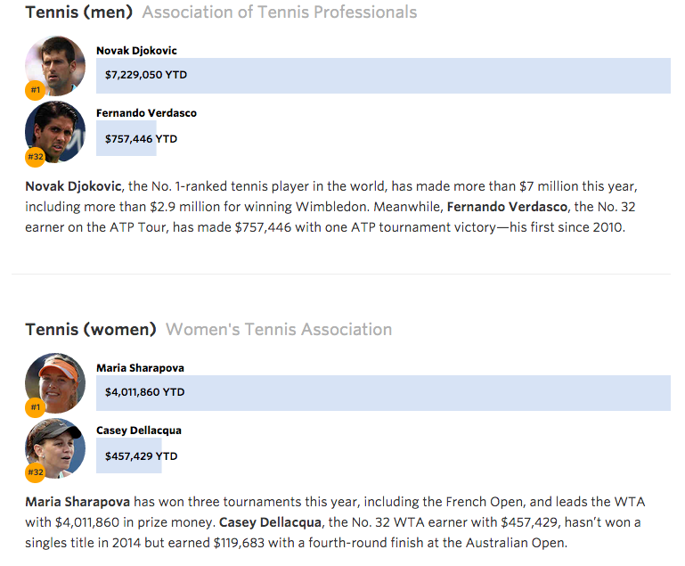
Note: The data from the wsj article is as of August 22, 2014. After the 2015 Australian Open, the no. 1 ranked male and female players are Novak Djokocic and Serena Williams respectively – they also both won the Australian. The no. 32 players are Fernando Verdasco (still!) and Coco Vandeweghe.
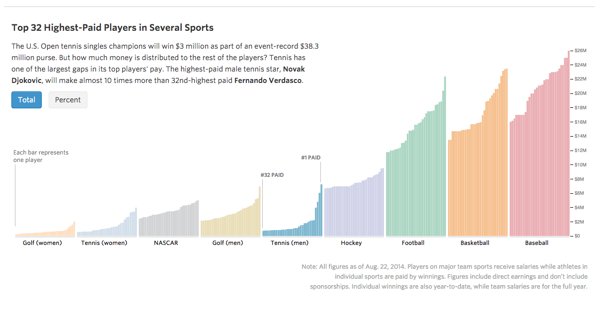
The article also showed a graphic comparing the incomes (just from playing, endorsements are excluded) of the No.1 up to the No. 32 highest paid players across many professional sports.
I actually have an explanation for the income disparity in tennis.
Tennis follows an elimination format, where the losing player in a match of two opponents goes home. The winner gets to play in the next round. The cycle is repeated until one player – the champion – remains.
In a grand slam, the 128 players are halved to 64 in the next round, and halved again to 32 in the next round, and so on and so forth. That’s geometric progression.
The prize money also follows (somewhat) a geometric progression in the reverse. The money the player receives sort of doubles as he/she progresses to the next round.
Here is the prize money breakdown for the recently concluded 2015 Australian Open.
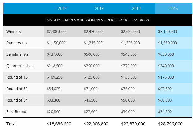
The ratio between the winner’s paycheck and for those who lost in the round of 32? 31.8 or 32 if you round it off.
The ratio between the winner’s paycheck and for those who lost in the first round? 90. That is better than 128 if geometric progression was strictly followed, so the first rounders were lucky here.
Who’s not lucky? The losing semifinalists. The ratio of the winner’s prize to theirs is 4.8. If geometric progression was strictly followed, they should earn 1/4 of the champion’s check which is AUD 775,000; 125,000 more than they were given. Fault!
The money prizes in other professional sports do not follow that of tennis. In fact, for team sports, players’ incomes come from salaries not prizes. This is why the disparity is those sports is not as marked. In fact, the incomes of players in team sports actually seem homogenous. That makes sense. A team should act as one, right?
If tennis players consistently play to their rankings – the no. 1 is always the champion, the no. 3 is always a losing semifinalist, the no. 27 is always eliminated at the round of 32, etc. – the disparity would even be more marked.
Players have good and bad days, so they play better or worse (Hello Roger Federer!) than what their ranking predicts. Prize money also varies among different tournaments. Those factors actually reduces the income disparity. Just like our favorite tennis players, geometric progression doesn’t win all the time.
– Finance MD
thefinancemd.com

Hi…Came over from Blogging 101 to say hi! Looks like you have a wide background and plenty of topics for your blog. I’m sure this course will help you with lots of ideas. http://lilypupslife.wordpress.com/
LikeLike